Themes & styling
json-to-office keeps content and appearance separate: your document JSON says what to render, a theme says how it should look. Because colors and fonts are referenced through semantic tokens rather than hard-coded values, swapping one theme name restyles an entire document — no find-and-replace across your JSON.
Semantic color tokens
Anywhere a component accepts a color, you can pass either a literal hex value ("#0066CC") or a semantic token ("primary", "accent", ...). Tokens are resolved against the active theme at generate time. Authoring with tokens is what makes documents portable across themes, so prefer them over raw hex whenever the color has a role (brand color, muted text, subtle border) rather than a one-off value.
The two formats use different token schemes.
DOCX: 13 required colors + 3 optional
Word themes define thirteen required color keys, plus three optional chart-series slots:
| Group | Tokens | Required |
|---|---|---|
| Core | primary, secondary, accent | yes |
| Text | text, textPrimary, textSecondary, textMuted | yes |
| Background | background, backgroundPrimary, backgroundSecondary | yes |
| Border | border, borderPrimary, borderSecondary | yes |
| Chart | accent4, accent5, accent6 | no |
accent4–accent6 carry the same names as the PPTX slots below. They exist for the chart palette, but once a theme defines one it is an ordinary token: any component color prop can name it. Every built-in DOCX theme fills all three (each with chart-series colors in its own palette), so "accent4" resolves under any bundled theme; under a custom theme that leaves them unset, referencing one throws like any other unknown name.
Resolution rules:
- A
#RRGGBBvalue is validated and used as-is; an invalid hex string throws at generate time. - Any other string is looked up in the theme's color map (merged over built-in defaults) and resolved recursively — a theme color's value may itself be another token name (e.g.
"border": "backgroundSecondary"), and the chain is followed until a hex value is reached. - An unknown token name throws. DOCX color resolution is strict by design: a typo fails the build instead of silently producing a wrong color.
PPTX: 10-slot scheme
PowerPoint themes use a 10-slot palette. Five slots are required, five optional:
| Slot | Required | Typical role |
|---|---|---|
primary | yes | Main brand color, first chart series |
secondary | yes | Second brand color |
accent | yes | Highlight color |
background | yes | Slide background |
text | yes | Main text color |
text2 | no | Secondary text (subtitles, captions) |
background2 | no | Alternate background (cards, stripes) |
accent4, accent5, accent6 | no | Extra chart-series colors |
PowerPoint-style aliases are accepted anywhere a token is: accent1 → primary, accent2 → secondary, accent3 → accent, tx1 → text, tx2 → text2, bg1 → background, bg2 → background2. This lets JSON produced from existing PowerPoint conventions resolve naturally.
Resolution is more forgiving than DOCX:
- If a token points at an optional slot the theme did not fill, the resolver falls back to
primaryand emits aTHEME_COLOR_FALLBACKwarning. - Literal hex values may omit the
#, and 3-digit shorthand is expanded (FFF→FFFFFF). A string that is neither a token nor valid hex produces anUNKNOWN_COLORwarning.
Charts inherit the palette
The pptx chart and the highcharts component in both formats default their series colors to the same six tokens in the same order — ['primary', 'secondary', 'accent', 'accent4', 'accent5', 'accent6'] — so a theme that fills every slot gives you one on-brand chart palette across a deck and a document.
A theme that fills only some of them behaves identically in both formats too: the unset slot is dropped, the palette is only as long as the theme has tokens defined, and the chart library reuses that shorter list. No warning is emitted — the fallback rule above governs a token named explicitly, not the implicit chart palette. Every built-in DOCX theme fills accent4–accent6, so a docx chart on a bundled theme draws from six curated series colors. See Charts.
Shared visual roles
Add a type ladder and palette without changing a bundled theme. For example, use this root on a DOCX document:
{
  "name": "docx",
  "props": {
    "theme": "vermilion",
    "themeOverrides": {
      "palette": {
        "rule": "#58595B",
        "textMuted": "rule",
        "chart": ["primary", "accent", "rule"]
      },
      "typography": {
        "roles": {
          "display": {
            "face": "heading",
            "weight": 300,
            "case": "upper",
            "color": "primary"
          },
          "source": { "size": 9, "color": "textMuted" }
        },
        "scale": { "a4": { "base": 12, "ratio": 1.25, "baselinePt": 4 } }
      },
      "spacing": { "canvas": { "a4": { "safeAreaIn": 0.75 } } }
    }
  },
  "children": [
    {
      "name": "paragraph",
      "props": { "text": "A stronger report", "themeStyle": "display" }
    },
    {
      "name": "paragraph",
      "props": { "text": "Source: field observations", "themeStyle": "source" }
    }
  ]
}
PPTX themes accept the same layers; use wide169 or standard43 scales and style: "display" on text. A theme controls visual values only. It does not require a title, source line or any other content. Chrome recipes are what the DOCX blocks paint from — key-takeaways, cover and running-head today; motif recipes store values for later rendering work. See the shared visual reference for precedence, units and case behavior.
Built-in themes
DOCX themes
Four themes are always registered (statically imported, so they exist independent of any dist build); minimal is the default and the fallback for unknown names. consulting is the house style the design-quality programme builds on — opt in with props.theme for now; it becomes the default in a later major release.
| Theme | Display name | primary | secondary | accent | Heading font | Body font | Mono font | Voice |
|---|---|---|---|---|---|---|---|---|
minimal | Minimal Clean | #2B302B | #4A5B4E | #6E7F71 | Calibri 21 | Calibri 10 | Courier New 10 | Quiet and warm: sage-green ink on ivory neutrals, tracked-tight bold title, wide margins |
devportal | Field Editorial | #12191F | #172028 | #E35B3F | Helvetica 23 | Helvetica 9.5 | Courier New 10 | Compact editorial: near-black ink, burnt-orange accent, condensed titles, warm tints |
vermilion | Vermilion Editorial | #282829 | #58595B | #EF4130 | Arial 24 | Calibri 10.5 | Courier New 10 | Poster-red display headings with wide tracking, ink text, warm creams |
consulting | Consulting House | #1A1F26 | #4B5563 | #1B4F8A | Arial 16 | Calibri 10.5 | Consolas 9.5 | The house report style: near-black ink, three greys, one deep blue, hairline rules, no fills behind text |
Every bundled theme also states whenToUse beside its description: the voice says what it looks like, the use says which documents it suits, and jto_discover, jto://themes and the generated design guide quote both, so an agent chooses a look rather than inventing one.
Every bundled theme defines the full heading1–heading6 ladder, title/subtitle, and componentDefaults for tables, lists, images and statistics — so a document that uses any component gets the theme's treatment without stating anything. consulting, vermilion and devportal carry the shared visual layers in full; consulting was the first: every type role (display 22pt, stat 18pt, chartLabel 9pt, source 8pt and the rest, from a 10.5pt base at ratio 1.2), the palette roles with a blue-and-grey chart series, an 8pt spacing base, and the chrome recipes blocks paint from — the key-takeaways box, the cover, the running head and footer. Safe fonts only — Arial, Calibri, Consolas — so it needs no font setup anywhere, and the chart typography it injects draws with faces every export server host has. It requires nothing: a document on it gets the look, and only a blueprint or profile asks for trackers, sources or footers. minimal and devportal carry the palettes and type of the shipped practice-note and field-review examples, which state no themeOverrides at all; vermilion's table default is the vermilion-annual-report recipe: gray hairline rows, open sides, red bold headers over a red hairline rule. minimal and devportal also define TOC1–TOC3 entry styles. vermilion paints its display, stat and table-header roles in the vermilion, sets its scale at ratio 1.25 with a 0.8in safe area and rules the cover with a 4pt red line; devportal condenses the display role, letterspaces its labels, sets a 9.5pt base at ratio 1.2 with a 0.75in safe area and rules the cover at 3pt. Both keep the chart series ordered from their own accent; both are safe-font themes, so neither needs a registry.
Every family the bundled themes name has a metric-compatible substitute in the hosted playground's LibreOffice preview image (Helvetica/Arial → Liberation Sans, Calibri → Carlito, Courier New → Liberation Mono), so the PDF preview breaks lines where Word does. When picking fonts for a custom theme, prefer those families — or Times New Roman and Cambria, which are covered too; Georgia, Verdana, Menlo, Monaco and Consolas fall back to DejaVu faces with different metrics, and Segoe UI to Carlito.
PPTX themes
Six built-in themes: default, dark, minimal, consulting, vermilion and devportal. An unknown theme name silently falls back to default. consulting is the twin of the DOCX house theme: the same ink, greys, accent, positive/negative, ordered chart series, chrome recipes and motif, Arial over Calibri with Consolas for code — safe fonts only — so a deck and its report match without restyling. It is opt-in for now; it becomes the default in a later major release. vermilion and devportal are twins of the DOCX alternates on the same terms: palette roles, chart series, chrome recipes, motif and font families shared with the report theme of the same name, and an agreement test holds each pair together.
| Slot | default | dark | minimal | consulting | vermilion | devportal |
|---|---|---|---|---|---|---|
primary | #4472C4 | #5B9BD5 | #000000 | #1A1F26 | #282829 | #12191F |
secondary | #ED7D31 | #FF6F61 | #666666 | #4B5563 | #58595B | #172028 |
accent | #70AD47 | #6BCB77 | #999999 | #1B4F8A | #EF4130 | #E35B3F |
background | #FFFFFF | #2D2D2D | #FFFFFF | #FFFFFF | #FFFFFF | #FFFFFF |
text | #333333 | #FFFFFF | #000000 | #1A1F26 | #282829 | #232323 |
text2 | #44546A | #CCCCCC | #444444 | #4B5563 | #58595B | #46494C |
background2 | #E7E6E6 | #3D3D3D | #F5F5F5 | #F2F4F7 | #FAF7F5 | #F7ECE7 |
accent4 | #FFC000 | #FFB347 | #BBBBBB | #5B8DC9 | #F4857A | #46494C |
accent5 | #5B9BD5 | #77DD77 | #DDDDDD | #A9C4E4 | #F9C4BE | #8A9299 |
accent6 | #70AD47 | #AEC6CF | #888888 | #7B8794 | #939598 | #E8A18D |
| Fonts (heading / body) | Arial / Arial | Arial / Arial | Helvetica / Helvetica | Arial / Calibri | Arial / Calibri | Helvetica / Helvetica |
| Defaults | 18pt, #333333 | 18pt, #FFFFFF | 18pt, #000000 | 14pt, #1A1F26 | 14pt, #282829 | 14pt, #232323 |
consulting also carries the shared visual layers: every type role (display 28pt, stat 40pt, quote 18pt, eyebrow 10pt tracked caps, chartLabel 11pt, source and footer 9pt), the palette roles with the same blue-and-grey chart series as the report, a 12 × 8 grid with a half-inch safe area on both 16:9 and 4:3, hairline table borders and gridline-light chart defaults, and the chrome recipes the action-chart block binds. One projection differs from the report on purpose: the small roles — footer, tracker, source — take text2 rather than textMuted, because a 9pt run in the light grey sits under the 4.5 : 1 the contrast rule asks of projected text. A deck on consulting inherits the look and nothing else; only the consulting-deck quality profile asks a slide for a takeaway or a source.
The first three share the same set of style presets; consulting, vermilion and devportal set their own, left-aligned and smaller (title 32pt bold — 30pt on devportal — subtitle 16pt, heading1 24pt bold, body 14pt, caption 10pt), vermilion painting title and heading1 in the accent:
| Preset | Size | Weight/emphasis | Color token | Alignment |
|---|---|---|---|---|
title | 36 | bold | text | center |
subtitle | 20 | italic | text2 | center |
heading1 | 28 | bold | primary | — |
heading2 | 22 | bold | primary | — |
heading3 | 18 | bold | text | — |
body | 14 | — | — | — |
caption | 10 | italic | text2 | — |
Gallery: the house theme and both alternates, in both formats
Rendered through LibreOffice from the two playground templates that carry the house theme — the DOCX client-report-blocks report page and the PPTX consulting-deck-blocks action-chart slide — on each of the three extended themes; the alternates are the same two documents with only props.theme changed. In every pair the same ink, greys, accent and chart series; the report's running head and the deck's tracker, source line and page number are painted from the same chrome recipes.
| Theme | DOCX report page | PPTX content slide |
|---|---|---|
consulting | 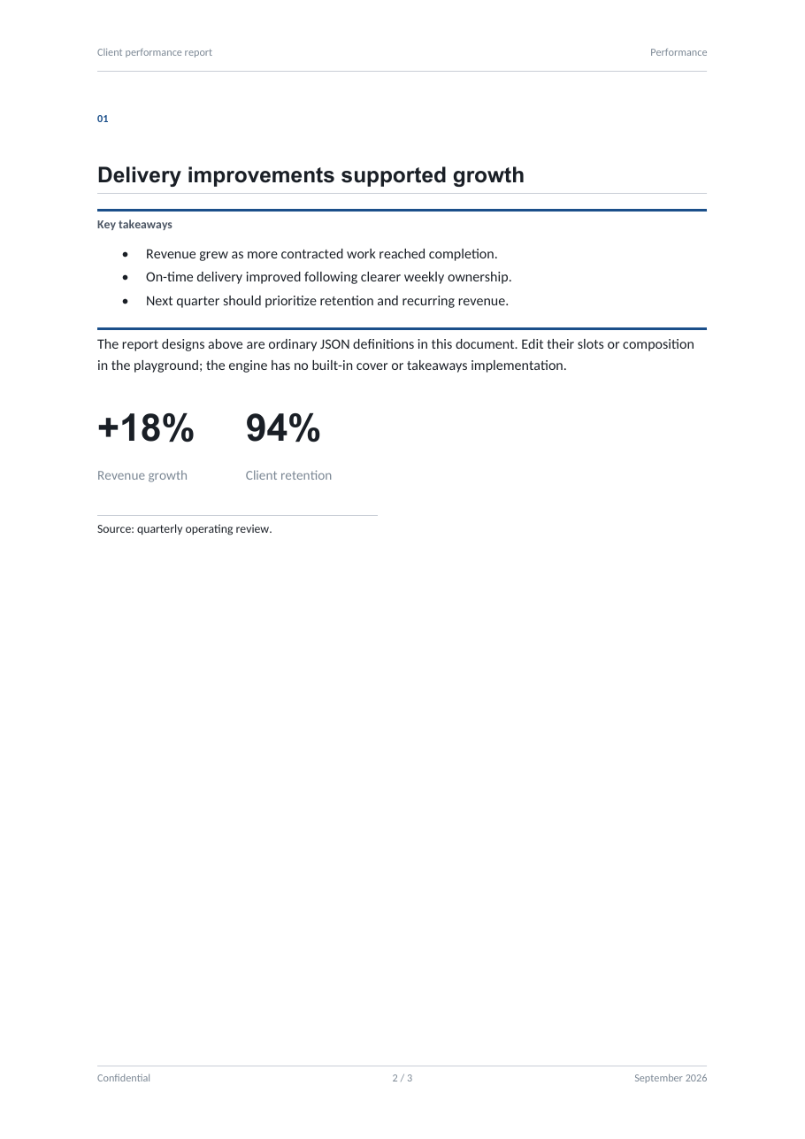 | 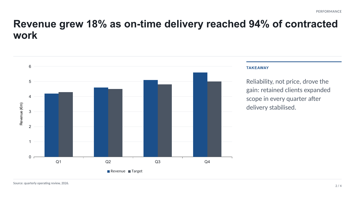 |
vermilion | 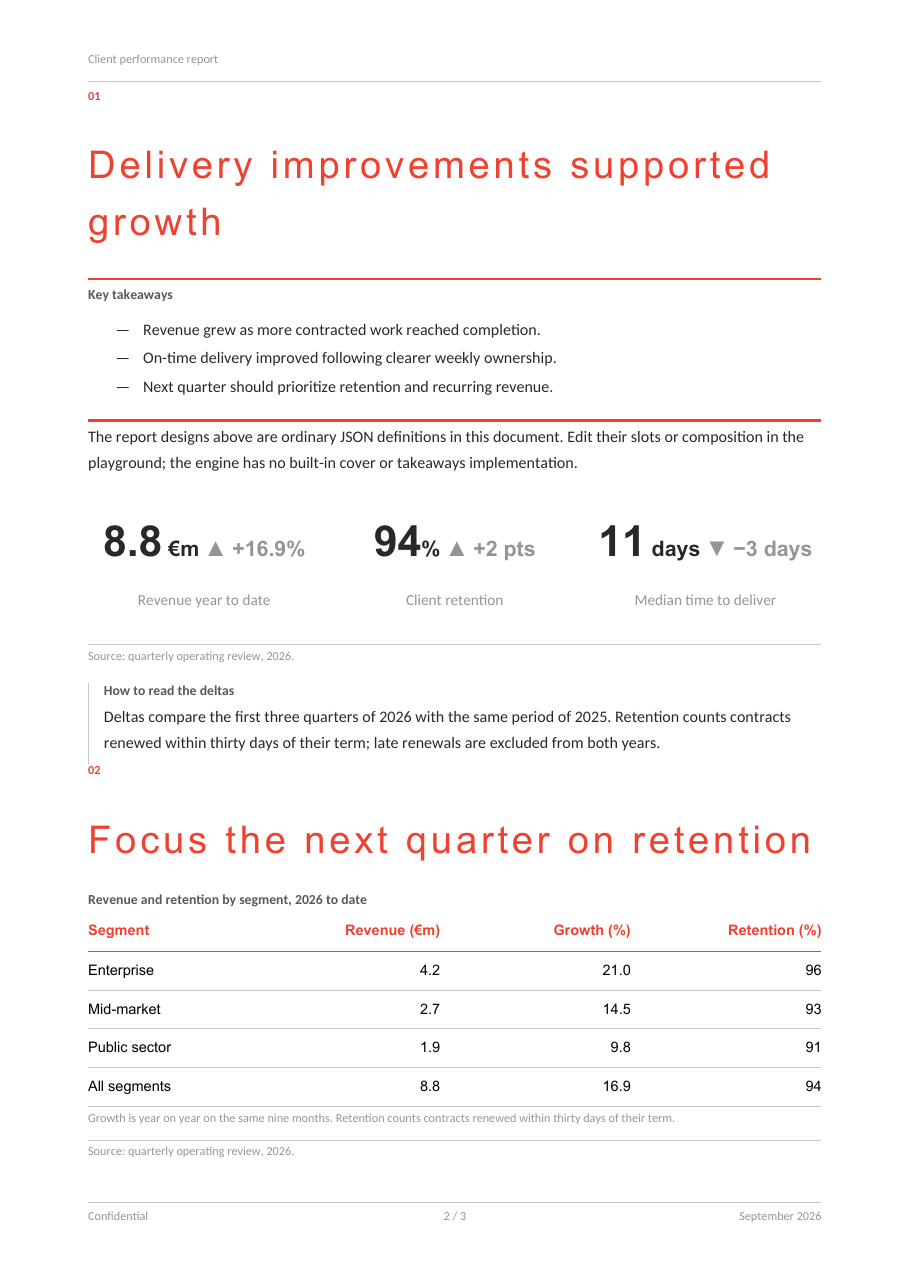 | 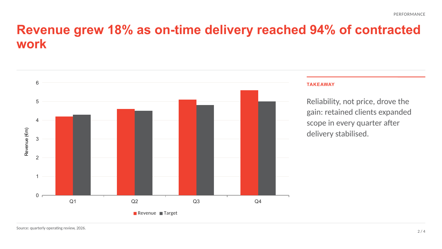 |
devportal | 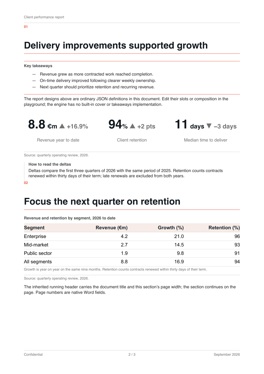 | 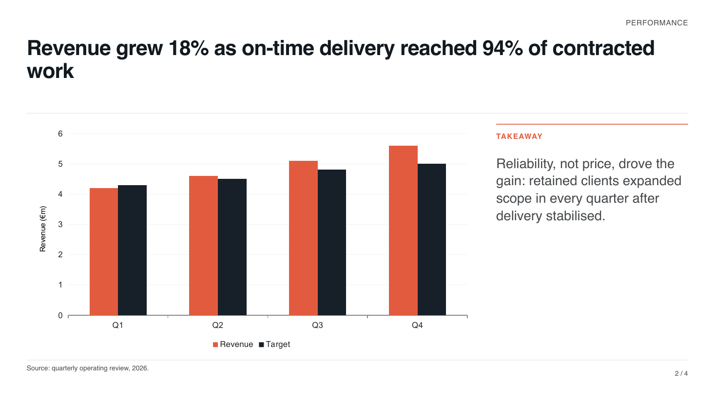 |
Applying a theme
Set props.theme on the root component. For DOCX (default "minimal"):
{
  "name": "docx",
  "props": { "theme": "devportal" },
  "children": [
    {
      "name": "section",
      "props": {},
      "children": [
        {
          "name": "heading",
          "props": { "text": "Quarterly Report", "level": 1 }
        }
      ]
    }
  ]
}
For PPTX (default "default"):
{
  "name": "pptx",
  "props": { "theme": "dark" },
  "children": [
    {
      "name": "slide",
      "props": {},
      "children": [
        { "name": "text", "props": { "text": "Q3 Review", "style": "title" } }
      ]
    }
  ]
}
Custom themes
PPTX: inline theme object
For presentations, props.theme accepts either a theme name or a full inline theme object, keeping the document fully self-contained — one JSON file carries content and branding:
{
  "name": "pptx",
  "props": {
    "theme": {
      "name": "brand",
      "colors": {
        "primary": "#0C2340",
        "secondary": "#1B3A5C",
        "accent": "#D4A843",
        "background": "#FFFFFF",
        "text": "#1A1A1A",
        "text2": "#5A6B7C",
        "accent4": "#8A9BAA",
        "accent5": "#C4A35A",
        "accent6": "#2E4A66"
      },
      "fonts": { "heading": "Georgia", "body": "Calibri" },
      "defaults": { "fontSize": 18, "fontColor": "#1A1A1A" }
    }
  },
  "children": []
}
At generate time the inline object is normalized into a named custom-theme entry (using theme.name, or inline-theme if unnamed) before the pipeline runs.
DOCX: customThemes option or CLI flags
The DOCX document schema deliberately keeps props.theme string-only. Custom Word themes are supplied out-of-band:
Library — pass a name-to-config map via options.customThemes (exact name match first, then case-insensitive, then built-in fallback):
import { generateAndSaveFromJson } from '@json-to-office/core-docx';
import brandTheme from './brand.docx.theme.json';

await generateAndSaveFromJson(documentJson, 'report.docx', {
  customThemes: { brand: brandTheme },
});
CLI — point at a theme file with --theme-path, or name a built-in with --theme:
# --theme-path loads and registers the theme file; also accepts a JS/TS module
# exporting `default` or `theme`
jto docx generate report.json --theme-path ./brand.docx.theme.json

# --theme selects a built-in (or a customThemes key, or a .json path)
jto docx generate report.json --theme modern
Both flags apply on every run — with plugins loaded and without — and both override the document's own props.theme. They also outrank the config file, as a pair: passing either flag discards both config-file keys (theme and themePath), so a config-file themePath never beats a --theme on the command line. Use no flag and the config file keeps both of its keys, where the theme path is tried before the theme name. With nothing requested anywhere, props.theme applies unchanged. A theme file loaded via --theme-path is additionally registered under its name, so props.theme can still reference it by name. A theme that cannot be resolved leaves props.theme in charge instead of falling back to a default, and warns — Unknown theme "X"; keeping the document's own theme for a --theme value that names nothing, Failed to load theme from <path>: <reason> for a --theme-path that cannot be read. See the CLI reference.
Theme files are loaded with hardening guards (.json only, 10 MB cap, path-traversal checks) — see Theme schema reference for details, and the full file formats for both DOCX and PPTX themes.
componentDefaults cascade
Both theme files and documents can set default props per component type, so you can say "every table hides its borders" once instead of on every table. The cascade, weakest to strongest:
- Built-in component defaults
- Theme
componentDefaults - Document
props.componentDefaults(deep-merged on top of the theme's) - Props set on the component itself
Merging is a deep merge: nested objects merge key-by-key with the stronger layer winning, arrays are replaced wholesale. A component with no props key at all behaves exactly like one with "props": {} — it picks up the same defaults; there is no carve-out for propless nodes.
Whether the key may be omitted is a separate question
Defaults treat a missing props as {}; validation does not accept it everywhere. Each registry entry decides, and the published JSON Schema is generated from that same decision, so an editor wired to $schema and the validator agree. In DOCX the key is omissible on section, toc, image, text-box and the docx root; in PPTX only on slide — the pptx root requires it (write "props": {}), and so does every content component. See Validation for the full rule.
Only real component props are valid componentDefaults. For table that means borderColor, borderSize, hideBorders, cellDefaults, headerCellDefaults, columns, width, keepInOnePage, keepNext, and repeatHeaderOnPageBreak — the schema is a strict partial of the component's props, so an invented key such as striped, borders, borderWidth, headerBackground or headerColor fails theme validation. Header styling goes through headerCellDefaults (backgroundColor, color), border width through borderSize, and borders on or off through hideBorders.
{
  "name": "docx",
  "props": {
    "theme": "minimal",
    "componentDefaults": {
      "table": {
        "repeatHeaderOnPageBreak": true,
        "cellDefaults": { "padding": 6 }
      }
    }
  },
  "children": [
    {
      "name": "section",
      "props": {},
      "children": [
        {
          "name": "table",
          "props": {
            "repeatHeaderOnPageBreak": false,
            "columns": [
              {
                "header": { "content": "Metric" },
                "cells": [{ "content": "Revenue" }]
              },
              {
                "header": { "content": "Value" },
                "cells": [{ "content": "1.2M" }]
              }
            ]
          }
        }
      ]
    }
  ]
}
Here every table inherits 6-point cell padding and repeating headers from the document defaults, but this particular table opts back out of header repetition.
Available keys differ per format:
- DOCX:
heading,paragraph,image,statistic,table,section,columns,list - PPTX:
text,image,shape,table,highcharts,chart
Using style presets
PPTX: the style prop
Text components reference one of the seven preset names (title, subtitle, heading1, heading2, heading3, body, caption) — or one of the type roles a theme declares — via style. The cascade is: component props → style preset → theme defaults. Anything you set inline wins over the preset:
{
  "name": "text",
  "props": { "text": "Roadmap", "style": "heading1", "color": "accent" }
}
title and heading* styles use the theme's heading font face; the others use the body font. Custom themes may override any subset of the seven presets under styles — unlisted presets keep their built-in definitions.
DOCX: real Word styles and themeStyle
A DOCX theme's styles block (normal, heading1–heading6, title, subtitle, TOC1–TOC6, plus arbitrary custom names) is compiled into real Word paragraph styles in the output file — heading components pick up heading1–heading6 automatically, and readers see the styles in Word's style gallery. A paragraph can opt into any named style with themeStyle:
{
  "name": "paragraph",
  "props": { "text": "A closing thought.", "themeStyle": "subtitle" }
}
TIP
Because DOCX styles become native Word styles, documents stay editable after generation: someone tweaking the file in Word inherits your typography instead of fighting direct formatting.
Where to go next
- Visual theme editor — build and preview a theme file in the playground without writing the JSON by hand
- Theme schema reference — every field of both theme file formats
- Fonts — safe fonts, substitution, registering custom typefaces
- Writing DOCX and Writing PPTX — theming in the context of full documents
- CLI reference — all
--theme/--theme-pathdetails